


STEP 01
Problem Framing
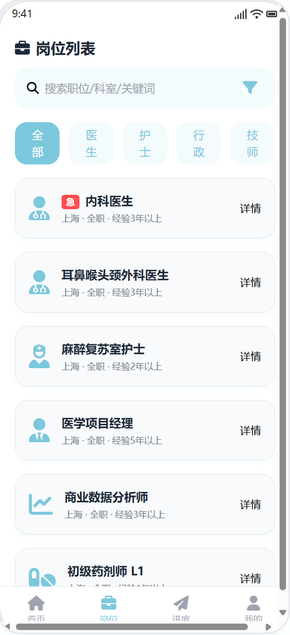
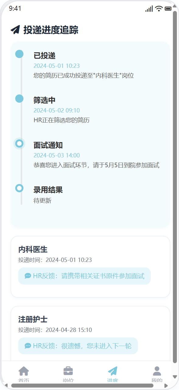
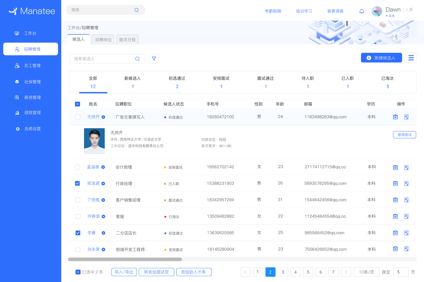
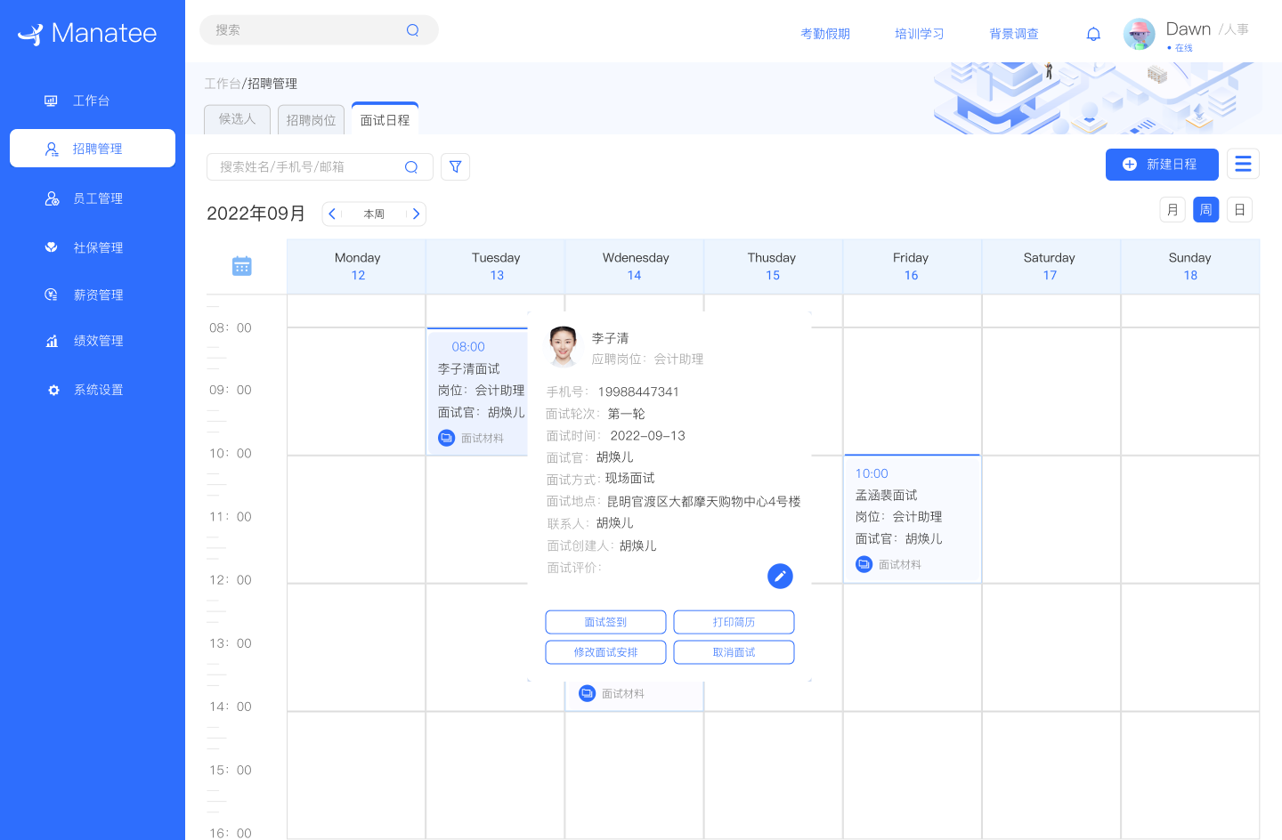
在真实招聘流程中,我发现核心问题并不集中在某一个页面,而是出现在流程衔接与状态理解之间的断层。
HR 经常需要反复确认:
这个候选人现在算不算"推进中"?
是否已经进入下一轮?
这个状态是系统规则,还是人为判断?
HR 经常需要反复确认:
这个候选人现在算不算"推进中"?
是否已经进入下一轮?
这个状态是系统规则,还是人为判断?
Focus
Reduce unnecessary confirmation
Goal
Clear and explainable status
Tone
Operational, not emotional